
Photo: Canva
← Back to Work
Customer Research · Selected Execution
Revealing the Podcast Listener
Primary research turned into personas and a sitemap that reshaped a podcast product through three rounds of usability testing.
Photo: Canva
Primary research turned into personas and a sitemap that reshaped a podcast product through three rounds of usability testing.
The Green Suits, a small and medium business recruiter, needed a new way to reach companies about building sustainability and corporate social responsibility initiatives to attract Millennial talent. Their social media and blogging efforts weren't working, and Indeed and LinkedIn were disrupting the recruiting market itself.
The Managing Principal, Dan Smolen, had a background in radio. With podcasting having recently broken into the mainstream, this was an opening: Green Suits Radio was born.
Before building anything, the team needed to understand the podcast listener, a question with almost no existing secondary research to answer it. The work started with secondary research into podcasting's origins, market size, and who does it well, then narrowed to three questions: why people listen, how they choose what to listen to, and which types of podcasts they gravitate toward.
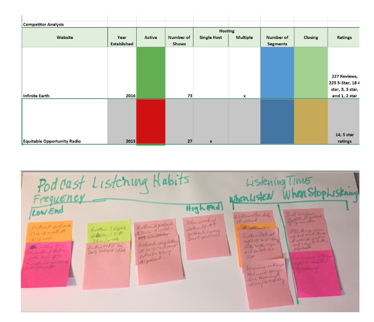

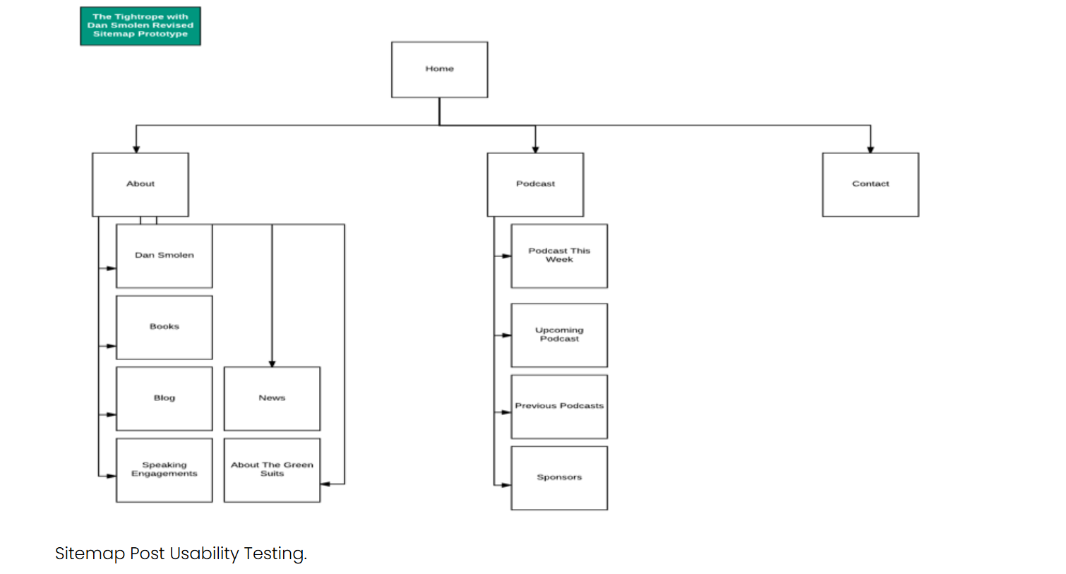
Both personas rated the existing website as their number one resource for learning more about a podcast, so testing started there. The prototype was iterated twice from that baseline, beginning with the existing website and iTunes podcast presentation rather than a blank page. In many ways, this was a redesign.
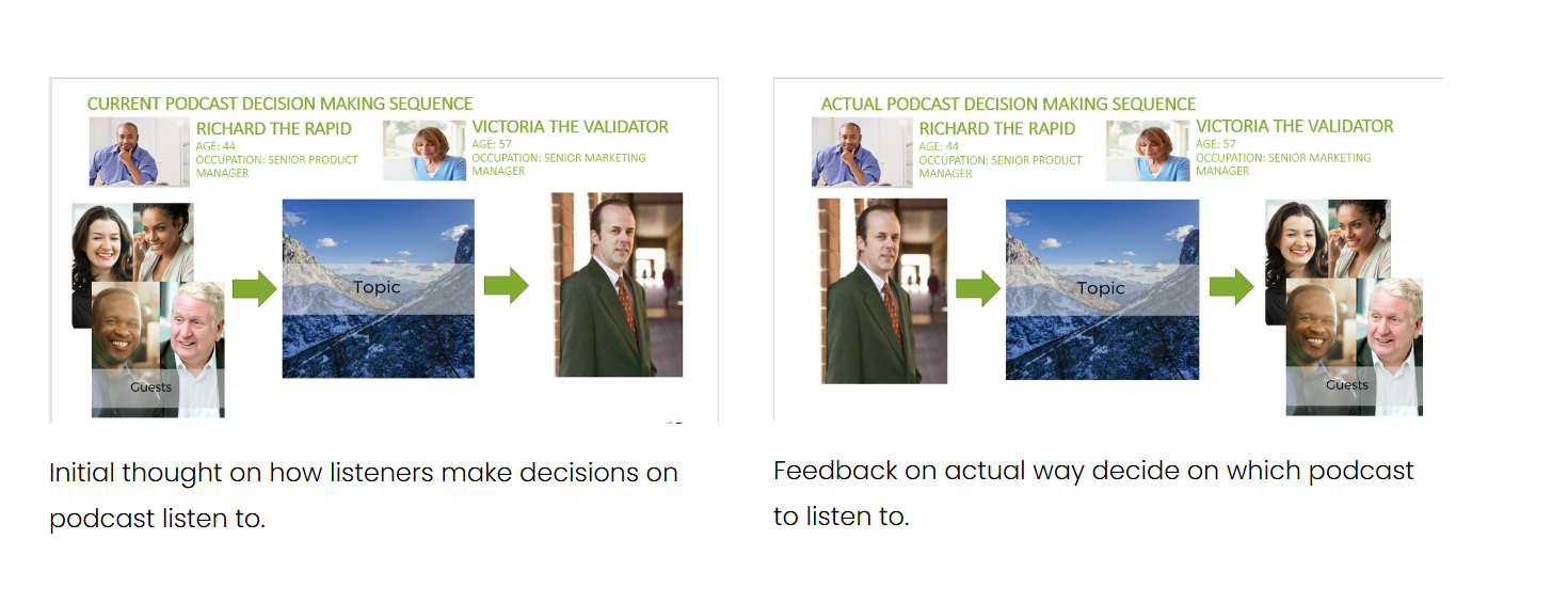
Round one tested the existing website and iTunes platform as they stood. Users didn't understand what the podcast was about because the site led with guest and topic rather than host, the actual order listeners used to judge credibility. The presentation was restructured to lead with host, then topic, then guest, and the topic range was broadened after learning listeners felt the original scope was too narrow.
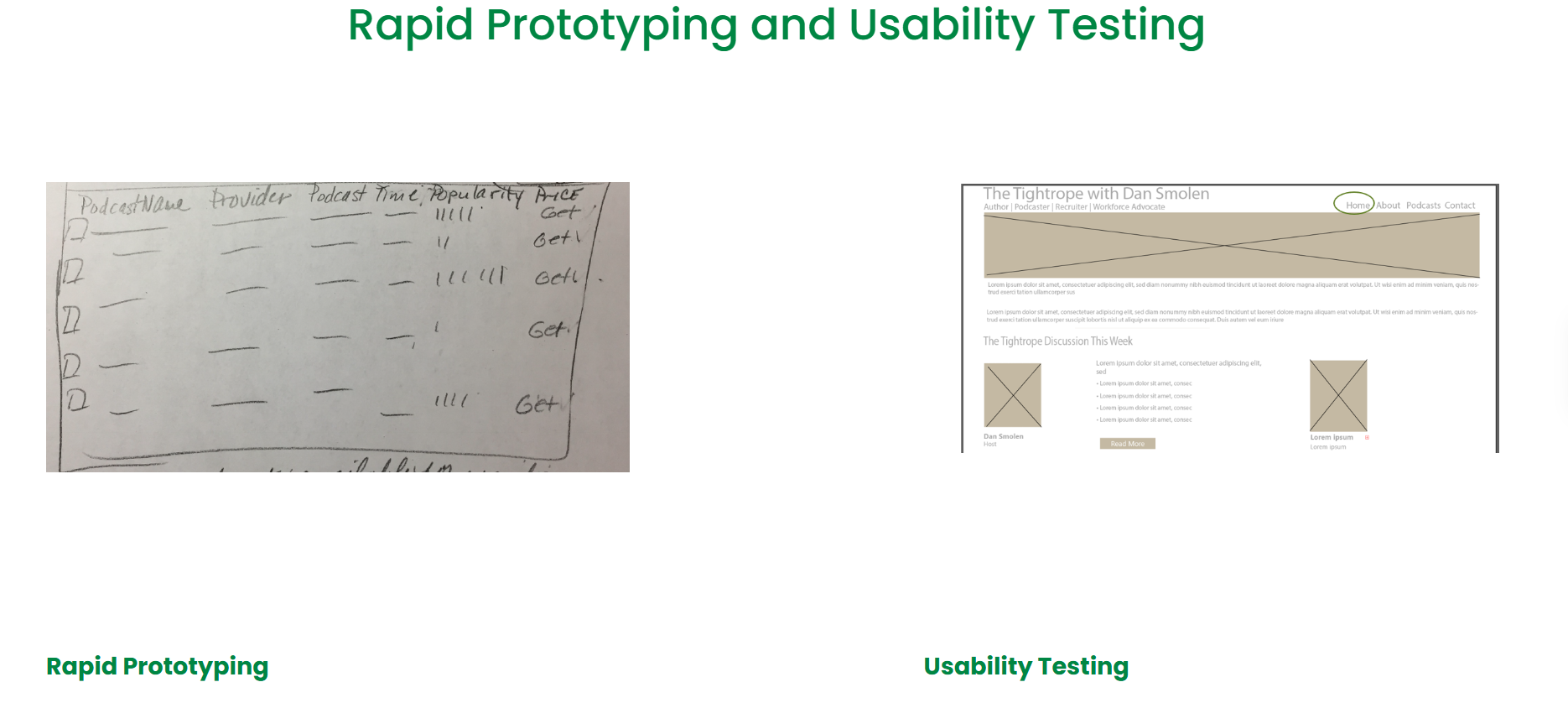
Round two moved to a low-fidelity paper prototype of the new website, informed by what round one exposed. It surfaced a navigation problem, too many topics, not enough clarity on the host's credibility, so the site's topic count was cut from 30 to 15 and a Community category was added.
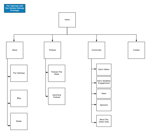
Round three moved to high-fidelity usability testing on the revised design. It refined the details further: introducing episodes with a photo of the topic rather than the guest, and pushing the Community feature to a later phase once it became clear it couldn't be delivered credibly in the first release.
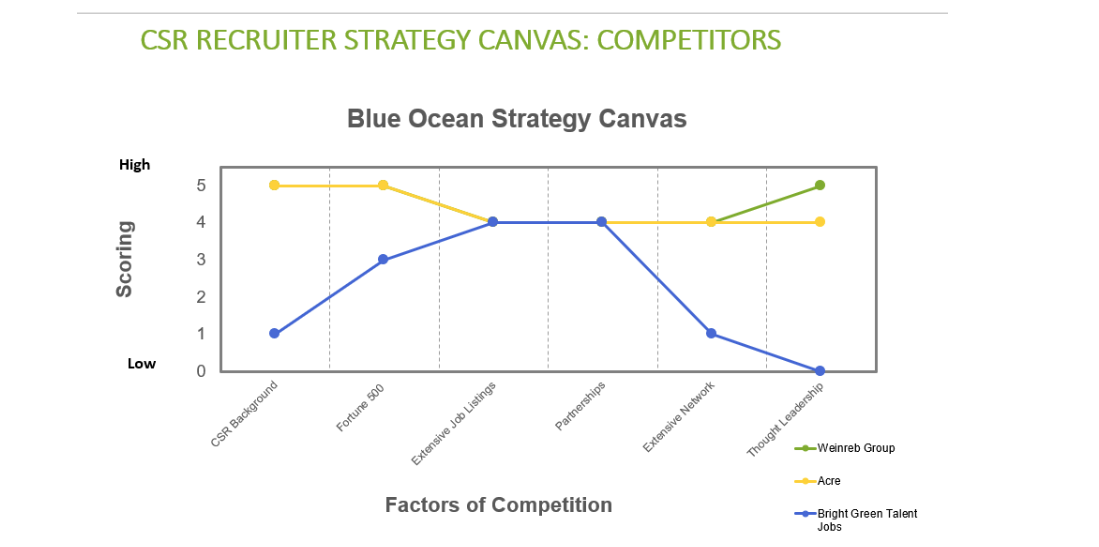
After the 2016 election, the client and the team revisited whether a sustainability and corporate-responsibility focus still made sense. Using a Blue Ocean Strategy Canvas to evaluate the competitive landscape, the data was clear: established competitors already owned that space with bigger audiences and stronger credentials.
What emerged instead was that sustainability and CSR were symptoms of a bigger story: the redefinition of work itself. The podcast was rebranded around exploring meaningful work.
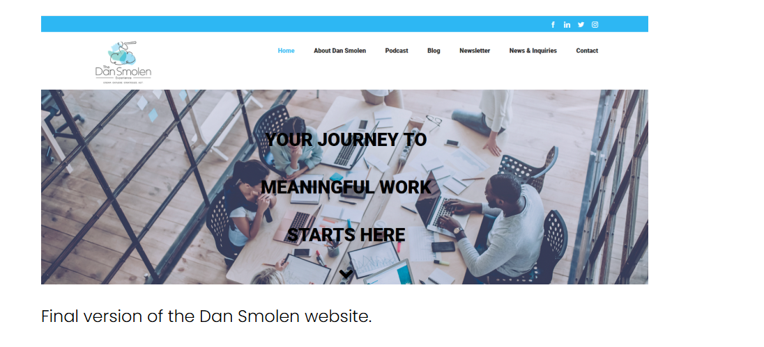
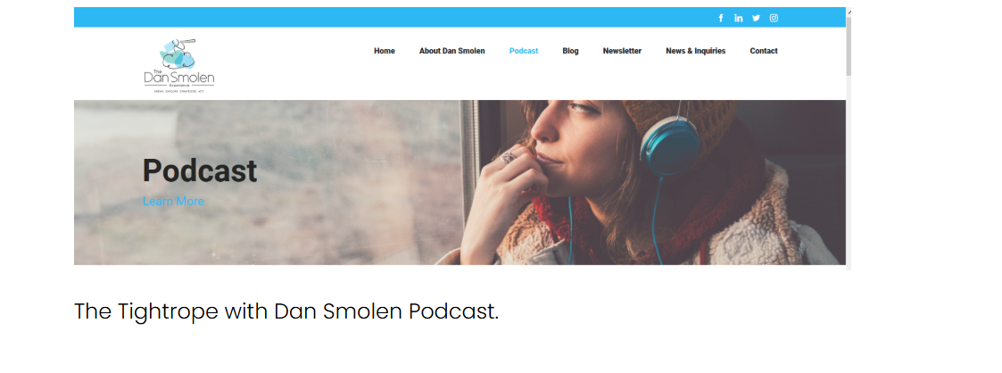
The podcast ran as The Tightrope with Dan Smolen. The client exited the recruiting business entirely to focus on podcasting full time, and the website redesign scoped during this project shipped.
Rapid prototyping only works if you understand what users think of the existing platform before deciding what to scrap. Usability testing means watching what people do, not just what they say: early-session reactions often shift by the end. And not every idea a user suggests, however appealing, is viable immediately; the discipline is knowing what to build now versus what to defer to a later phase without losing the thread.